5 Key Elements to A High Converting Landing Page
Whether you’re selling products online or trying to generate business, having a high-converting landing page focused on promoting just one thing is key to driving more sales and signups.
If you’re running an advertising campaign across social media, on search engines, or offline, having a well-designed landing page to funnel potential customers to will capture their attention and help with conversions, compared to a generic page of your website.
Making a landing page doesn’t have to be difficult, either. There are online tools out there like Leadpages and Unbounce that can help you with that. These landing page creators offer a variety of templates ready for any industry and type of promotion. All you have to do is change the text, images, and branding to suit your business and start driving traffic to it.
If you’re unsure what to add to your high-converting landing pages, I have you covered, with five elements and a bonus tip every landing page should have.

How to write a Landing Page that converts
There aren’t that many elements that you need to add to your landing page to improve your sign-ups and sale conversions. Still, getting them just right can take some thought and time.
However, writing something is better than writing nothing, and a dedicated page can lead to higher conversions than not having one. Create one for each campaign or product, and over time you’ll see an uptick in your conversion rates.
Here are 5 key elements every landing page should have.
1. Write a captivating headline
One of the first elements of your landing page that people will see is your headline. It’s usually the heading with the largest font size to make it stand out from the rest of the content on the page, especially above the fold.
This is why you need to write a headline that captures the attention of your landing page visitor as soon as they hit your page.
It’ll need to be short and tell your audience exactly what you do, or your product does within ten words or less. The shorter, the better, as long as it has enough information to capture your visitor’s interest.
Don’t try and explain everything about what you’re offering in the headline. That text is reserved for the subheadline and the benefits highlights further down the page. At this point, you’ll want to make the headline obvious, easily understood, and engaging.
Sometimes you can get away with being non-direct as long as you still capture the user’s attention.

Surfshark VPN does a good job of getting to the point with their bold heading, highlighting the free offer.
2. Sub heading value proposition
The next element to add to your landing page is a subheadline or a short paragraph of text giving your visitors a value proposition.
It should compliment the landing page headline by highlighting how the product or service can help them and letting them know what they will be getting when they click on the all-important call to action button placed below it.
When writing the subheading, be brief and to the point once again. You can always go into more detail about your services further down the page, but above the fold, your copy needs to attract attention, provide value and persuade your visitor to click through.

Sendinblue provide a short but concise back up to their headline letting you know what you can achieve with their software.
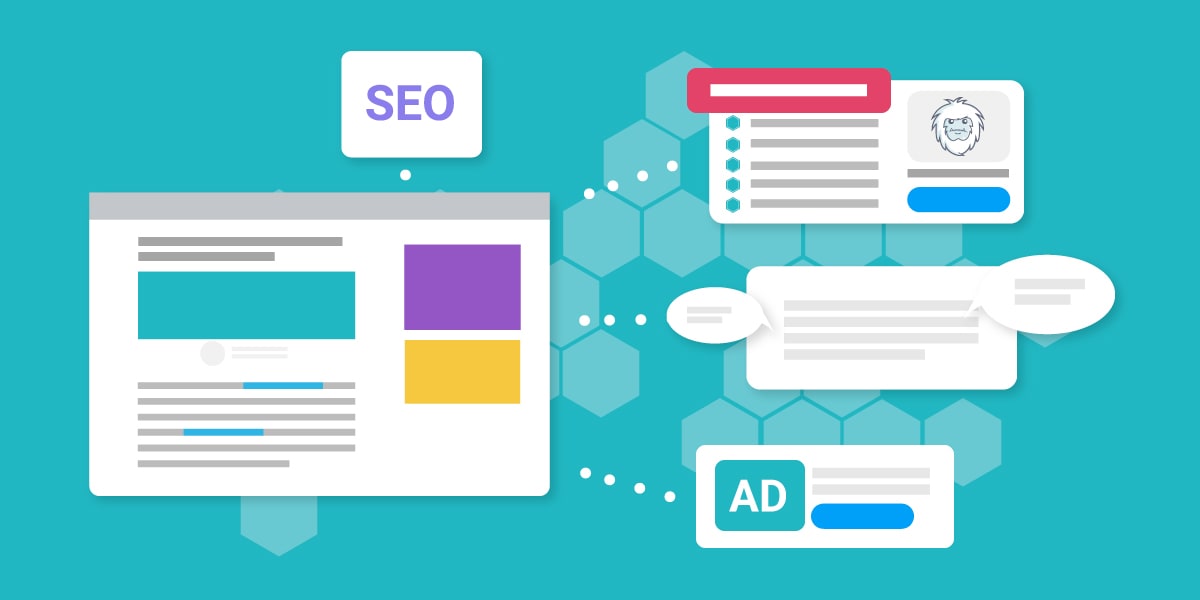
3. Add Image / Videos
Next is less about writing copy and more about creating attractive visuals to help sell your items.
Static images work well and are essential to any high-converting landing page.
Make them bright, large, and relevant to ensure that they provide added value to your landing page rather than just adding an image in there for the sake of it.
Typically on desktop, they’ll be placed to the right of the headline and subheading and, on mobile, appear underneath them but before your call to action button. They help show the visitor what they can expect from what you’re offering and can often help persuade people more than the text.
Do you know what’s better than an image?
That’s right, a video! Add a short video of 1 minute or so highlighting the benefits and how your product can eliminate any pain points and can do wonders for your conversion rates, helping boost them by 80% in some cases.
Many people have short attention spans and prefer to watch a video than read text. Hitting the play button is easier, and all the information they need is delivered to them with minimum effort.
Just be sure to be concise, with easy-to-digest information that can relate your brand and service with them, and you’ll see a higher conversion rate than using no image or just an image.

Leadpages provide a short video after the main headline and CTA to highlight the key benefits of what you can do with Leadpages, helping reinforce the text, in case you’re not sure whether or not to click.
4. Write an actionable CTA
It’s all well and good, having a captivating headline, a persuasive subheading, and an engaging image or video. Still, without a Call To Action button for your visitor to press, there’s nowhere for them to go.
You need to give them a button to click that gets them to sign up to your email list or your purchase page so you can convert them into new leads and sales.
You could add a simple ‘Sign Up’ button or ‘Buy Now’ to your landing page and get some clicks. But to get those higher conversion rates, you’ll want to get creative.
When it comes to good CTA’s, though, it’s a not one-size fits all kind of scenario. It’ll depend on what you’re trying to accomplish and what you want your visitor to do.
A few example scenarios:
- If you’re selling a product and it has a 20% discount – instead of ‘Buy Now’ try ‘Grab Your 20% discount’.
- If you’re getting people to enroll for a course – instead of ‘Sign Up’ try ‘Enroll Today’ or ‘Enroll Now’.
- If you want someone to sign up to your email list – instead of ‘Sign Up’ try ‘Get instant access’ or ‘Send me it all’.
With your CTA, you’ll want to change it to fit the scenario and make sure they are approachable, taking the stress out of the decision to click by not making it sound like the user has to do some extra work once they’ve clicked it.
Make them bright so they stand out, and place them prominently on the page, typically above the fold and near your key components like the under the subheading, and you’ll find that your conversion rates will increase.

Mailchimp have created an actionable CTA with their ‘Start Building’ prompting you to click and get building straight away along with a focal color that stands out from the rest of the page.
Tip: why not test different CTA’s and see what works best for your landing pages.
5. Highlight the benefits
An addition to your new landing pages that can help persuade your visitors to take action is to highlight the benefits in an easy-to-consume way.
You might have added some into your subheading or video, but adding a list under your subheading or underneath your first CTA on the page can help drive home benefits and what they can achieve with whatever it is you’re promoting.
Keep each point short and easy to digest. Highlight one benefit or way that you can ease their pain in each point and make them stand out. Change the bullet point to a color or tick to help convey that these are valuable points rather than negative ones.
Of course, if you don’t have space above the fold due to your landing page design, adding a list of benefits in a separate area with another CTA can also benefit those looking for more information than your headline and subheading offer.

Cloudflare provide three key benefits of what you’ll get when using their service. Attaching it to the demo request form helps you know what to expect to see from the demo experience.
Bonus: Add Social Proof
The five elements above will help you create a landing page that converts higher than most, but one more element you can add to your landing page that can drive home the message of ‘this is the product/service for your visitors’ is social proof.
Adding testimonials from happy customers, which highlight how your product or service helped them accompanied by an image of them, if possible, will make the decision of clicking on your CTA all that easier for your visitor.
This evidence shows your user that people like them have already done what they are thinking of doing and are benefitting from it.
A few ways to add social proof include:
- Testimonials
- Product reviews
- Customer reviews
TrustPulse found that adding testimonials to sales pages can increase conversions by 34%. In fact, adding social proof to your site, no matter where is an excellent way to build trust with your visitors.

Everflow have added testimonials further down their landing page to reinforce the benefits of what other companies and people have found when using their product.
A few Landing Page Tips
Landing page optimization is outside the scope of this post. Still, I can’t let you leave without providing you with a few landing page optimization tips that can be useful when looking to increase your conversions higher.
- A/B testing – consider testing long landing pages vs short landing pages
- Make sure their optimized for mobile devices
- Stick to just one offer as adding multiplier offers can decrease conversion rates
- Make your CTA buttons stand out
- On longer landing pages add multiple CTA’s throughout to help capture more leads
- Keep it simple – don’t over sell and don’t add clutter
Popular Landing Page Builders
Not sure how to build a landing page on your website? Many landing page builders take out the complexity of the design and provide you with already high converting templates for landing pages for you to choose from.
Some let you create landing pages for free while adding other tools like AI-driven content and drag-and-drop editors to save you time generating your new landing page designs for your campaigns.
Here are a few ones to give a try.
High Converting Landing Pages Sum Up
If you’re not already creating landing pages for your website, you’re missing out. A landing page, no matter how simple or optimized, can still provide you with a boost in conversions that can have a dramatic effect on your business income.
Thanks to landing page builders, they are easy to create, and with these 5 elements on your page, you’ll be on to a winner with your online marketing strategy.
Be sure to create a new landing page for each new offer or product you’re promoting to avoid confusing your visitors with over cluttering and multiple offers.
Include a short and direct headline with a subheading that can expand more on it to help gain interest, and if you can, add a brief 30-second to a 1-minute video showcasing what you’re offering to add extra value to your page.
Give your CTA some thought; make it stand out and big enough that even those with the biggest of fingers can click it easily, and you’ll see your numbers increase.
Add a landing page to your website and let me know how much your conversions increase.